Launch Week Summary
An overview of what we shipped during our first Launch Week.
We did our first Launch Week where we released something new every day. Read this blog post to get an overview of what we announced during this time. Spoiler: It's a lot!
Day 1 - Monday 18 July
📚 Community Stories
Launch Week started with stories from community members who shared their favorite features about Raycast and gave an insight into how they use Raycast to make their day-to-day work smarter.
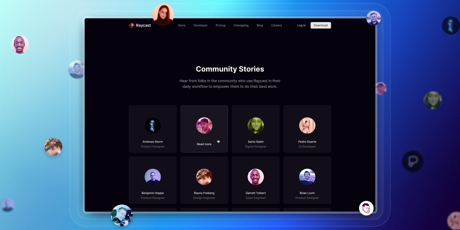
We had the opportunity to speak with a range of folks, from Product Designers and Engineers to Product Managers, across the globe, working at companies such as GitHub, Vercel, and Linear.
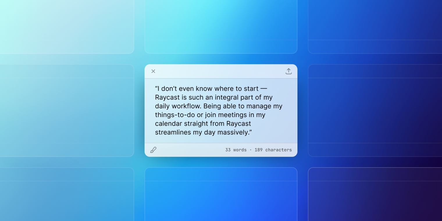
And since then, we’ve added eight more the following week for other community members that submitted their stories.
Day 2- Tuesday 19 July
💫 App Icon
Our long-overdue app icon received some much-anticipated attention, falling in line with Big Sur’s updated icon shape. We dropped a hint before launching our new face of the app, showcasing the many requests we’ve had over the last couple of years, and giving you an insight into what was to come.
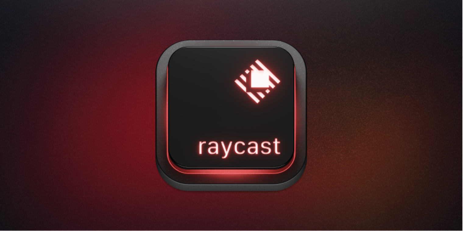
Over the last couple of years, we’ve explored multiple options and directions before settling on the metaphor of a keycap. We took the literal, tangible thing every user (should) use when opening Raycast and what they use to navigate through Raycast and put our spin on it.
The red glow brings in the element of the Raycast branding, with the (say it in Jony Ive’s accent) aluminum texture you come to expect from Apple products.
🖌️ App Experience
Along with the updated app icon, we also worked on a refresh to the app, including a much more consolidated design, with multiple community requests over the years.
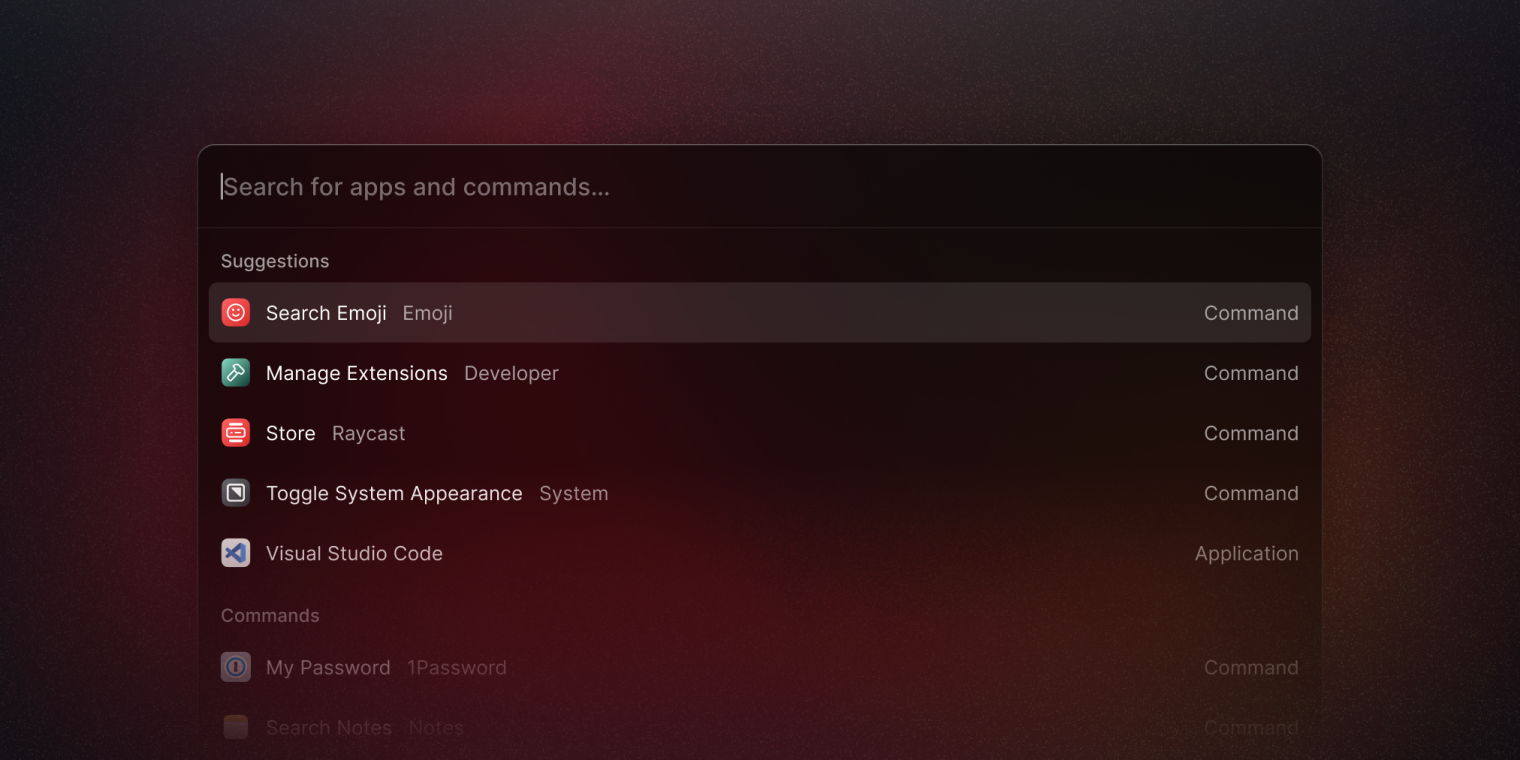
We started with increasing the size and height of the navigation bar. For some time, the feedback we’ve received is the navigation (search) bar is too small and feels lost amongst the results and other components. So we increased the height and text size and refined some other small accessories that sit within the navigation bar too.
And to balance out the new app, we wanted to bring more prominence to the command and application icons in a list view, increasing the size by 25%, from 16 to 20 pixels. While it might look like we’ve made a bigger change here, the subtle adjustment helps you identify commands and apps a lot quicker, speeding up the review time to read the title, and other text, before hitting enter.
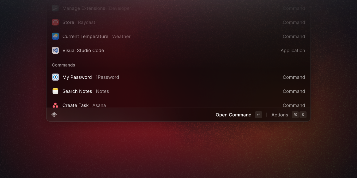
What might feel like the most significant change is our new Action Bar. What once used to be a small, floating button hiding the infamous action panel (⌘ K) is now a wholly redesigned component containing the primary and secondary actions, the previous floating tab, and toasts for user feedback during running actions.
The new and improved design brought three components into one. It opened up even more space than we had before to introduce more contextual and helpful information that once never existed and often constrained the overall experience for new and experienced users.
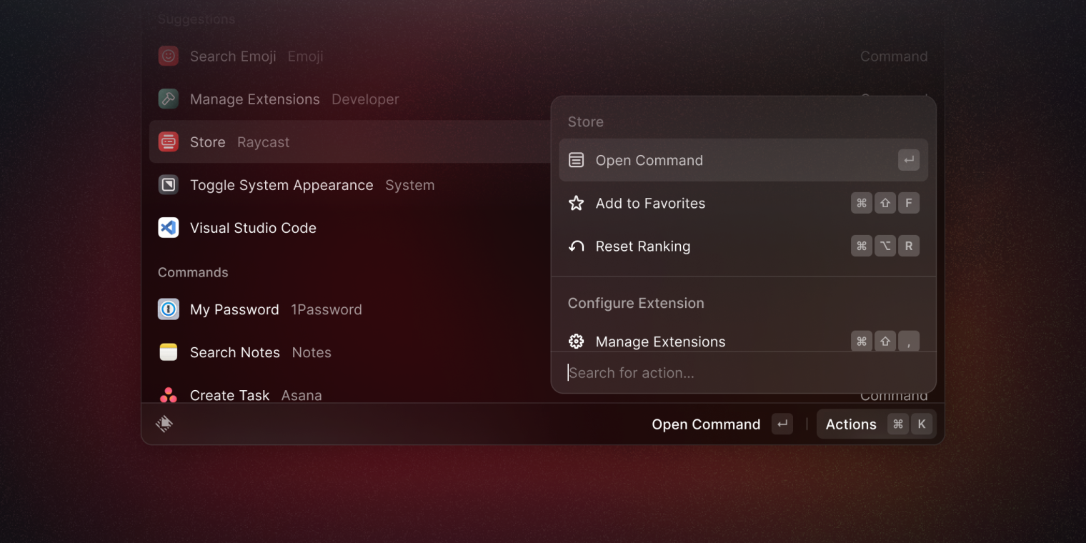
And we couldn’t introduce the Action Bar without giving the Action Panel a minor refresh too. We brought over a consistent list item component from what you see in the main app window. We updated the list view inside the Action Panel, making the new panel design feel more spacious and clear when looking for that all-important action.
🤏 Compact Mode
Something many have asked for, but probably many did not expect, was the introduction of Compact Mode – a way to open Raycast minimally – hiding the root list and suggestions.
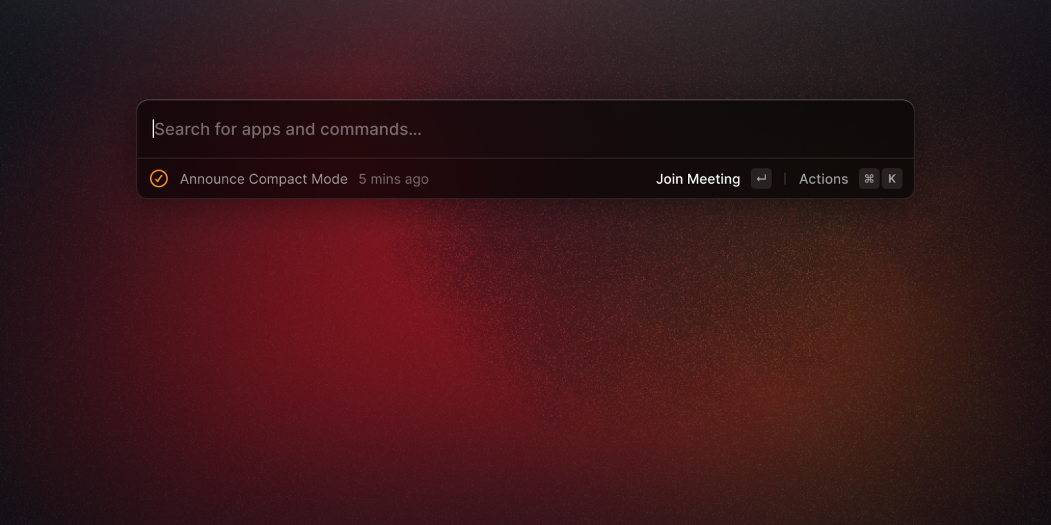
We added a new look when opening the Raycast app with the much more simplistic approach of only showing the navigation bar to search and the action bar for showing any top-of-the-list items and primary actions. Configurable from within Preferences, the Compact Mode is now a staple of Raycast.
🎨 Icon Set
We teamed up with James McDonald to bring a new and consistent icon set to our design system, also available in our API.
Before, our icon set combined icons from packs and custom variations to fit our needs. Now, after a collective effort between James and our designers, we redesigned our icon set and introduced over 400 icons to developers and designers.
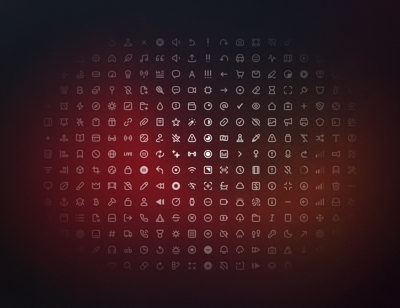
The new icon set allowed us to create a level of consistency that we didn’t have before and unblocked us from creating new icons at speed in the future. Now, with rules and guidelines, set stroke widths, and an agreement on radii, designing a new icon when we need one will be more accessible than ever.
Day 3 - Wednesday 20 July
👥 Raycast for Teams
At the midway stage of Launch Week, we officially launched Raycast for Teams out of beta, allowing companies to start using Raycast in their teams. Our launch started on Product Hunt, where we reached the 4th Product of the Day with 500 upvotes!
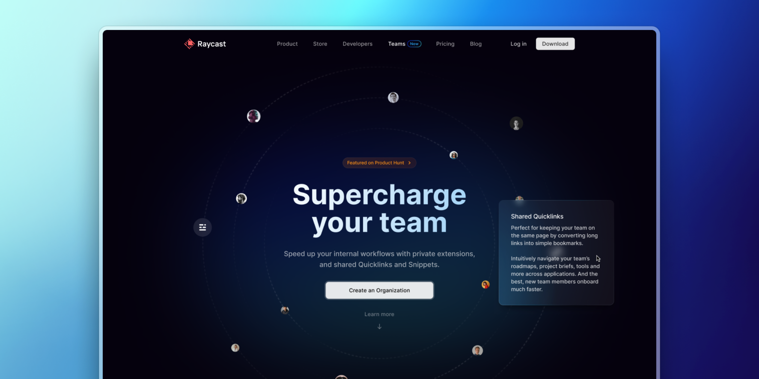
Teams can develop their extension to reimagine completing tasks and improving their daily workflows, sharing extensions with their team members. With shareable Quicklinks, they can stay on top of the latest documents and common links. Shareable Snippets speed up canned responses for things like support messages, or keep formats consistent in documentation.
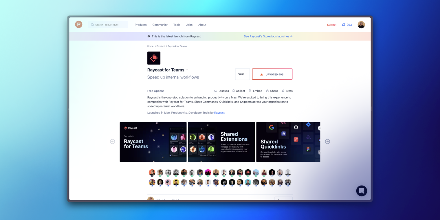
Want to learn more about Teams? Check it out here.
Day 4 - Thursday 21 July
🍫 Menu Bar Commands (Beta)
A while ago, we launched the Menu Bar option for My Schedule, and it received an overwhelming response.
Using the incredibly positive feedback, we saw an opportunity to extend your productivity in a new way – through the menu bar. And so, on Day Four, we launched Menu Bar Commands. A new way to stay on top of day-to-day information.
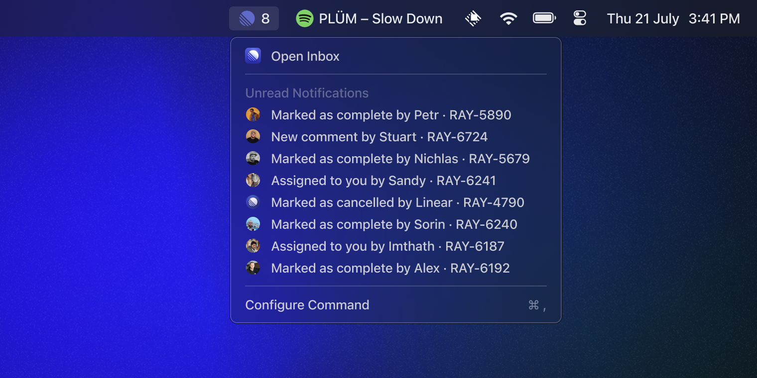
Developers can build extensions with menu bar commands and publish them to the Store so that you can see glance-able information at the top of your screen. We've already seen a great response in developers adopting new ways to make you productive. From Linear notifications to GitHub pull requests and even the latest track playing on Spotify.
🤬 Arguments for Commands
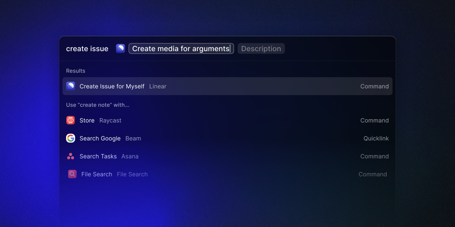
The long-awaited demand for arguments from Script Commands also went live on Thursday, now available in a command. So you can now create a Command and include up to three queries to search for information on your common websites or create an issue simply in Linear.
⚙️ API Updates
And to wrap up Day Four and the new additions to the API, we dropped a few more updates:
We ported Background Refresh from Script Commands to Extensions to keep Menu Bar Commands up-to-date. Background Refresh is configured with a new interval option in the Extension's manifest and works for "no-view" mode commands
We've released new React hooks to make it faster to build extensions that follow best practices. To do this, we looked at the Extension's repository for use cases and how we can improve them. Most Extensions connect to APIs: they make network requests, show a toast to handle errors, and add caching and optimistic updates to speed up interactions. Utils are available via a new public npm package.
In our progress to move our native Extensions over to the Store and open source them, we began migrating Linear, re-writing the entire Extension in TypeScript. We're proud that the API can power such complex extensions, and the Linear extension is now available for your contribution. We've also open sourced the Google Workspace, Zoom and Asana extensions after Launch Week.
Day 5 - Friday 22 July
👕 Community Swag
And finally, to end the week in style, we announced something to give back to the community for all the efforts and contributions: SWAG!
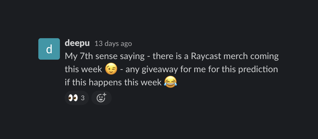
Except for Deepu, this may have come as a surprise to many (like a lot of Launch Week announcements), but we made sure to do it in total Raycast fashion – inside the app 😉
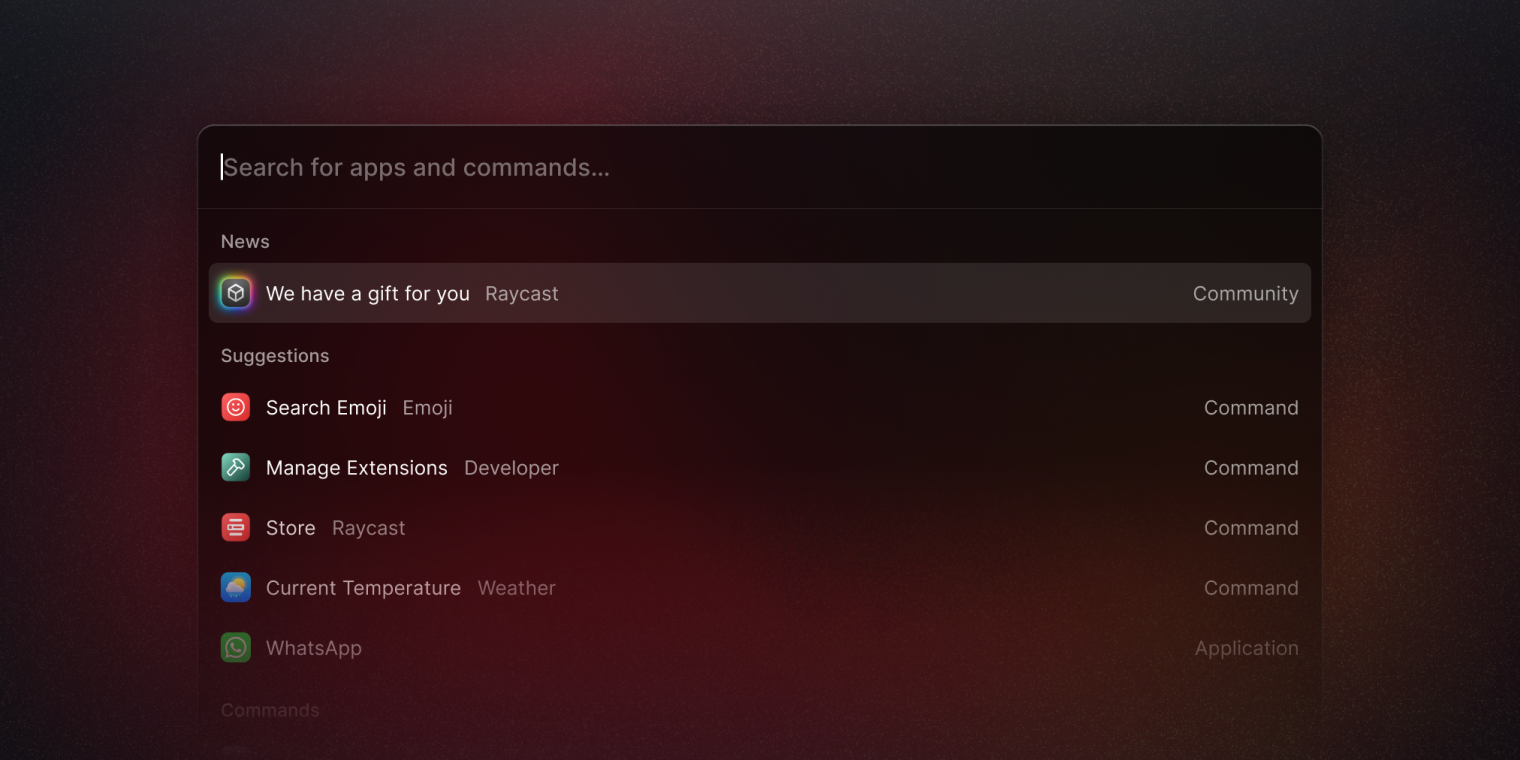
We hand-picked community members whom we felt made an impact on the community from their contributions to the Store, developing extensions, and providing support to others.
We wanted to ensure that the work and efforts of members in our community were rewarded and recognized, and to show our gratitude to people who are helping others and helping to make Raycast the product it is, that you know and love.
And that was our first Launch Week. We hope you enjoyed it as much as we did.
