A fresh look and feel
How we’ve changed our app design to make it even easier and faster to use.
We can't believe it's been almost two years since we announced Raycast to the world. And while the design of the macOS app has mostly stayed the same, many things around it have changed.
We introduced our Extensions API and Private Extensions Store, for example. Our Slack Community grew to more than 6,000 members. And tens of thousands of users have taken to using Raycast to make their everyday work smarter.
Today we're announcing a fresh look and feel to address the feedback and demand from our growing community.
Here at Raycast, we have three design principles: fast, simple, and delightful. We hope you can notice them in every corner of our products, from big features to tiny details. The changes we've made aim to make the app even easier and faster to use going forwards while maintaining its beauty through simplicity.
Here's what we've done and why 👇
1. A bigger search bar and icons
The search bar is at the center of Raycast. Almost every interaction goes through it. We've made the bar bigger to reflect its importance, grab the user's attention and set it apart from the search results below.
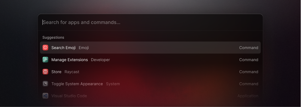
We also increased the size of the leading icon of the search results, making it quicker to scan for what you need to find.
2. An all-new action bar
Pressing ⌘ K in Raycast lets you find and take any action in the app. Magic, right? But despite being one of the essential features, it's been hidden behind a small button and is easy for new users to miss.
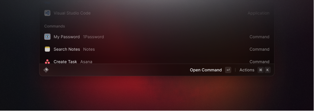
To fix this problem, we've simplified the user interface and consolidated actions, toasts, and navigation titles in an all-new action bar at the bottom of the window.
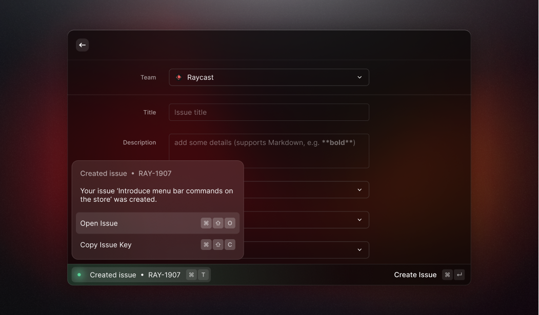
The left part of the bar shows the navigation title of the active command and any toast. We moved toasts into the app window and introduced a dedicated shortcut to expand them, making it quicker to show details.
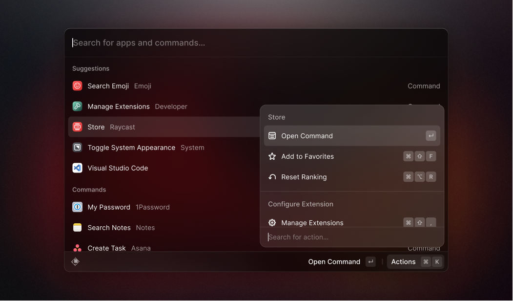
The right part of the bar shows actions available in the current context, along with their keyboard shortcut. This lets users learn action shortcuts to make using Raycast even faster.
3. Our new icon set
We collaborated with Designer James McDonald to overhaul our icons and create a distinguishable set that could be used across the app. He kept the icons simple with an outline style, and a bolder stroke width to make them more prominent.
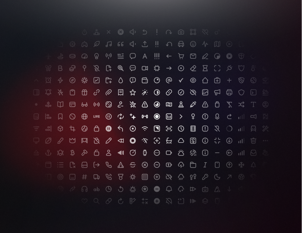
Here's what James had to say about the collaboration:
The team at Raycast reached out to me with a clear goal: "We want to revamp our icon set completely," – And that's what we did.
The icons follow the same rules for stroke width and corner radii. The result of these rules is a balanced set of icons that feel fresh and new, making them timeless for future updates.
4. More focus with Compact Mode
With Compact Mode, we've made Raycast's user interface more focused. A typical flow is to open Raycast and type in what you're looking for until you press enter to open the selected search result.
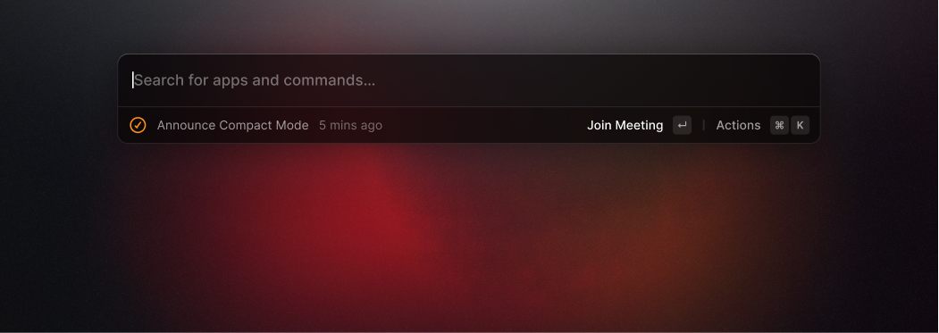
Compact Mode optimizes this flow, blending all other elements for a minimal appearance. The new mode can be enabled in Raycast's preferences to bring more focus to your work.
5. A fresh app icon
Since Apple announced Big Sur in November 2020, icons share a standard set of visual attributes, including the rounded-rectangle shape, front-facing perspective, and more. Since then, our round and flat app icon has felt outdated, so a new icon was long overdue.
But the wait is finally over! Here's our new app icon to fit nicely in your docks.
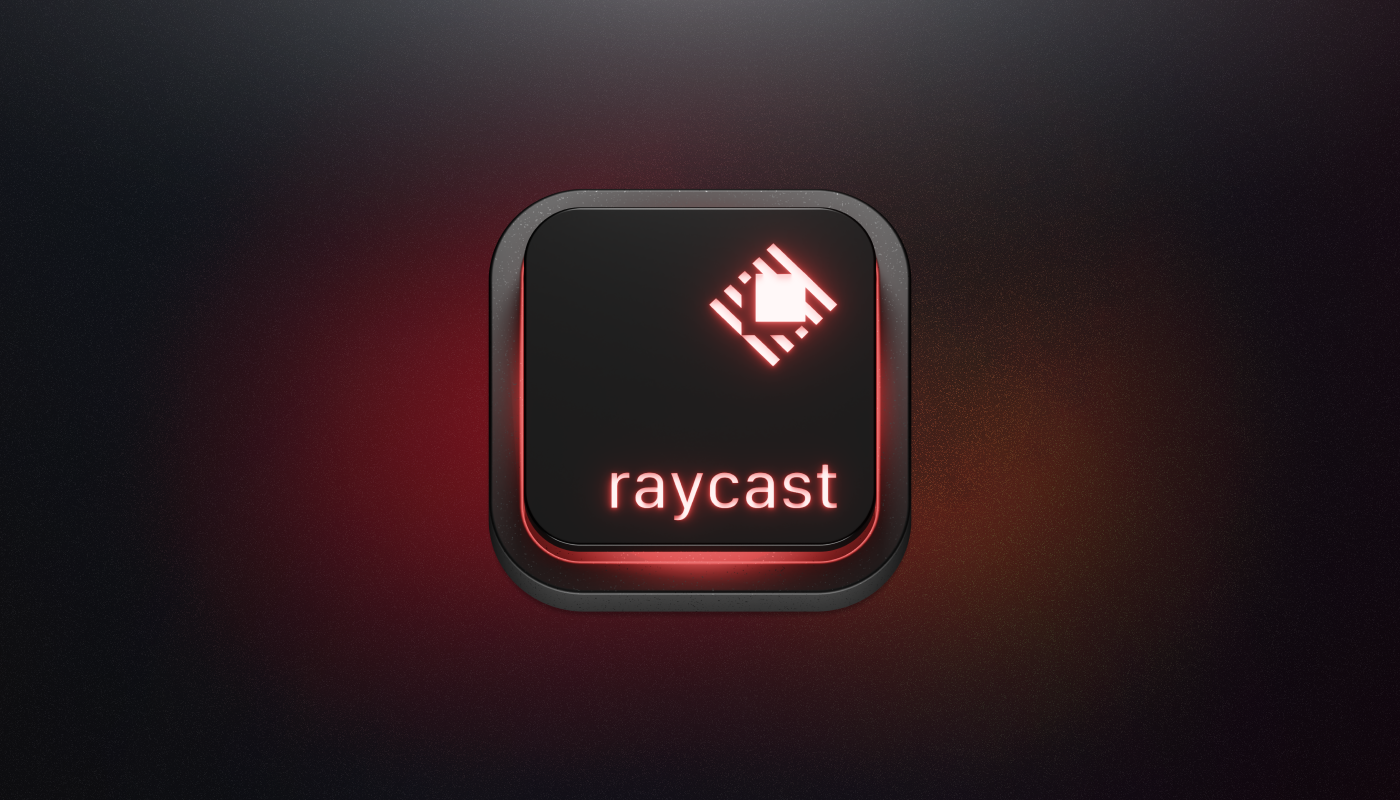
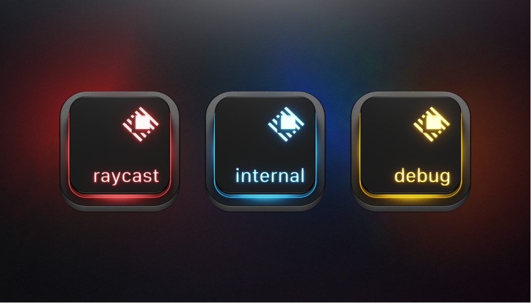
We experimented with metaphors to bring a three-dimensional look to our icon, trying glass cubes, magnifier glasses, and more. But what stuck was a keycap. The keycap represents our focus on the app's keyboard accessibility. Apple's Magic Keyboard inspired the visual look, allowing us to introduce alternative icons.
And that's it! We've made five changes to refresh the app's look and feel while keeping its core mechanics in place. Designing an app core to people's daily workflows isn't without its challenges. So as always, we'd love to know what you think about our new pixels.
